An interactive dashboard created using R Shiny
Migration data is from the Census of India website and the data was analysed for the publication: and another publication using the data is under progress as well.
For now, I have used a simple state-wise incoming and outgoing migration visualization for inter-state migration data for India.
Click here to access the Shiny App
A screenshot of the app with one state selected is below. You can exlore ‘To’ and ‘From’ migration patterns for different states from the shiny dashboard (from link) above.
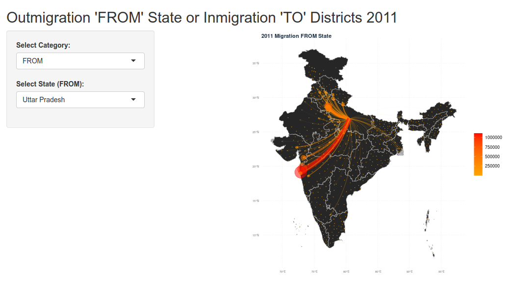
Please note that the incoming migrants (dots and lines) are to each district in the state while the outgoing migrant data is only available for each state (so the centroid of the state is considered).