A long while ago, our team in preparing a revised master plan for Bangalore 2031 got a household survey of Bangalore of 10,000 households done in which even income data was collected. It had information about income, expenditure, trips, employment and education among other things. Out of curiosity, I had checked the Gini index for the income data (in Excel) back then and I remember it to be 0.36 for the city. As income is one of those questions which may not be honestly answered, we did not pay much attention to it as even the sample size was only 10,000 although it was spatially well distributed.
Either way, now that I am brushing up on my economics, I was curious again about how different scenarios of income distribution would make the graph look. So putting the different scenarios below. I experimented with a lot of code and I am putting only the final clean code here
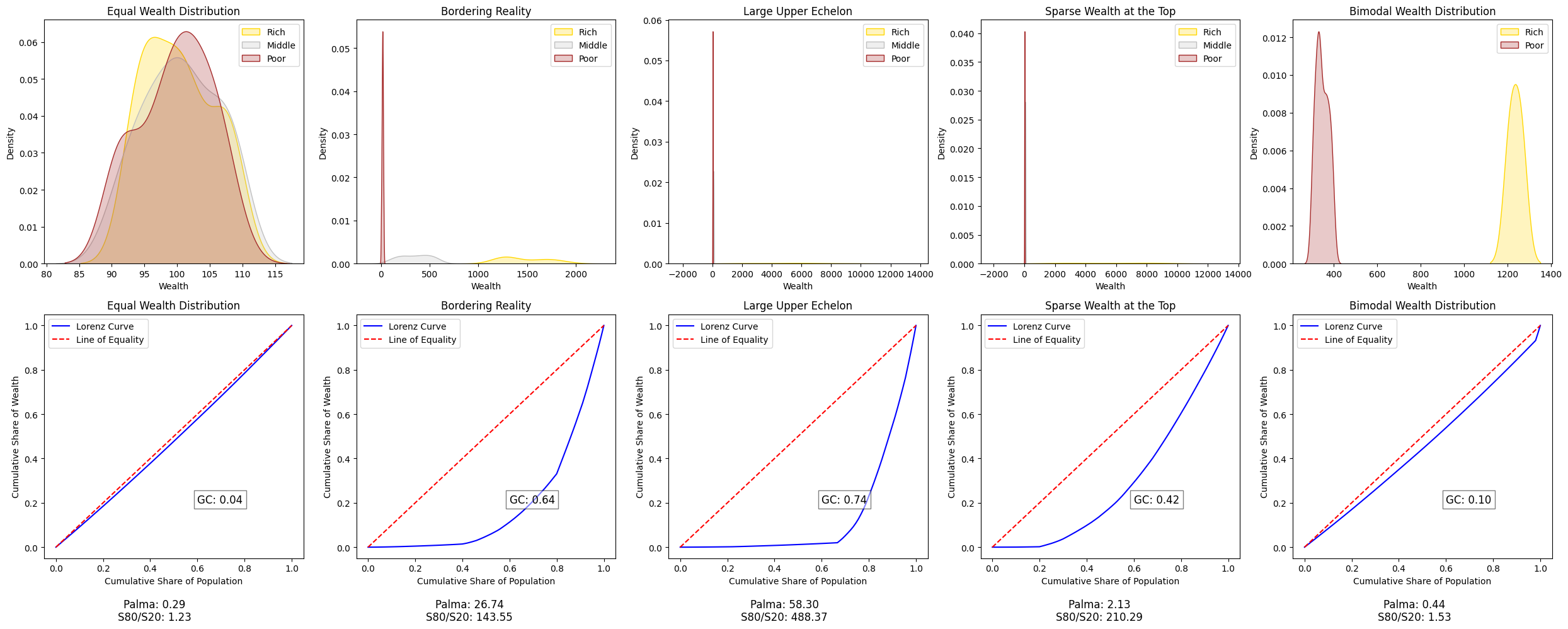
In this even if wealth was concentrated in a few hands while others are ‘equally’ ‘poor’, would also be considered ‘equal wealth distribution’. Here the ‘elbows’ or the sudden slope movements in the Lorenz curve (cumulative distribution) become very important to see what kind of egalitarian it is. Looking at the curve rather than the coefficient is a better indicator of if everyone’s equally ‘poor’ (very much possible) or equally ‘rich’ (I think this scenario is impossible).
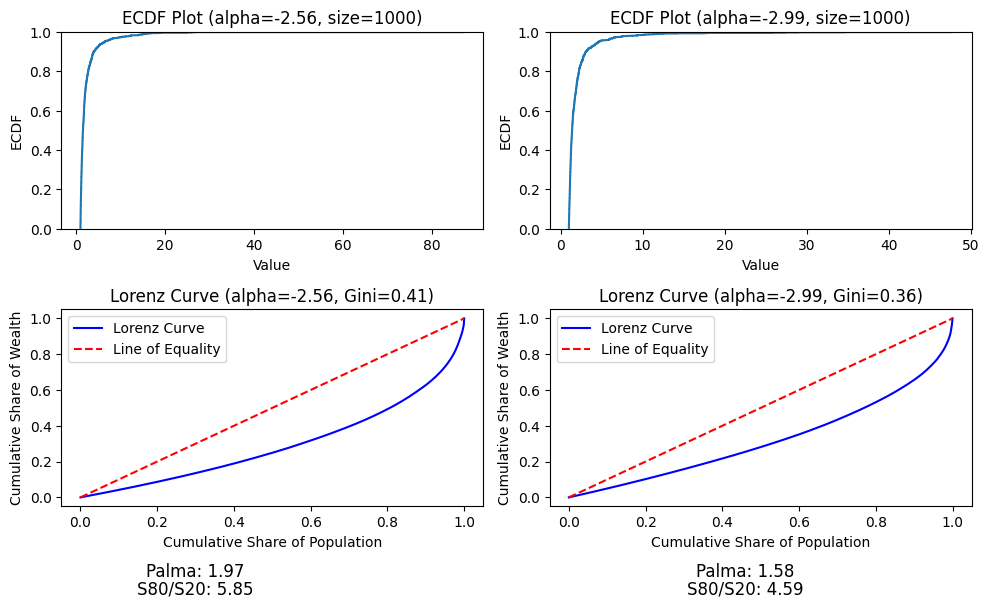
In case of power law distribution, which is generally seen in the real world cases, with alpha value, which is the scaling factor, between -2.5 and -3), the GC and LC are as below: