Bangalore has one of the world’s worst traffic. My team working on the Bangalore’s Masterplan had found that one of the main reasons for this worst traffic is that there are very few alternative routes connecting one place to another and so all the traffic has to rely on just one road, adding to the mounting volumes and time spent in traffic signals putting pressure on the major roads.
Bangalore is also infamous for its dead-end roads, courtesy of dear planning authorities approving the building plans and roads that way and inevitably compounded by the rapid pace of growth that the city has seen in the past few decades.
I have been working on a self-directed-project of using complex network analysis using osmnx and networkx in python for derriving solutions to this weakly connected city’s road network problem. The simplest start to this analysis would be to find out the edges with highest betweenness centralities to see which roads carry the highest volumes by being the connections between weakly connected components. However, I have a slow system, and until I have access to a higher processing speeds, I have taken up a part of the road network of Bangalore to do a few basic analysis and I am presenting a few of them here below:
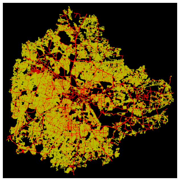
Bangalore’s (BBMP) road network visualized using osmnx and networkx in python in which residential is marked in yellow and all other roads are marked in red. The ‘residential’ classification is as given by open street map (osm):
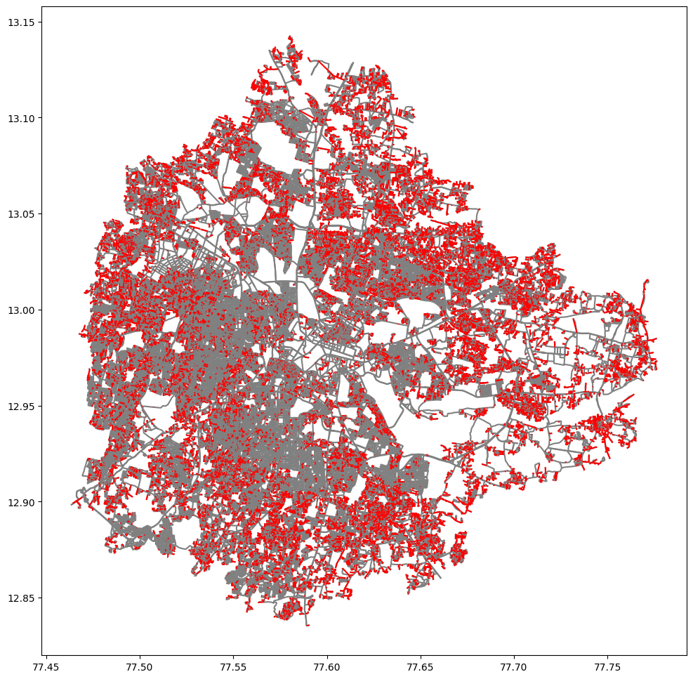
The below one shows dead-ends (red) in the BBMP area. If you are familiar with the whole city, you would also know that residential areas of the west and to some extent, south Bangalore have much better traffic flow compared to the rest especially east and north - which is reflected in this map. The reds show the dead-end concentrations. There are far more dead ends than are seen in areas with worst traffic jams.
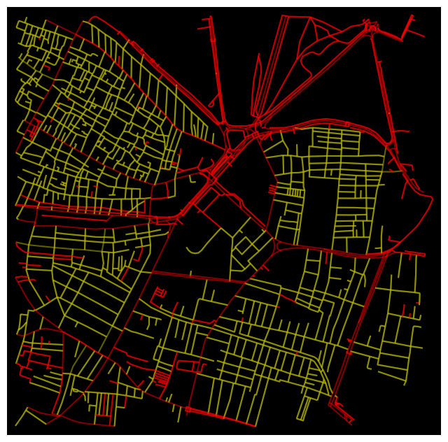
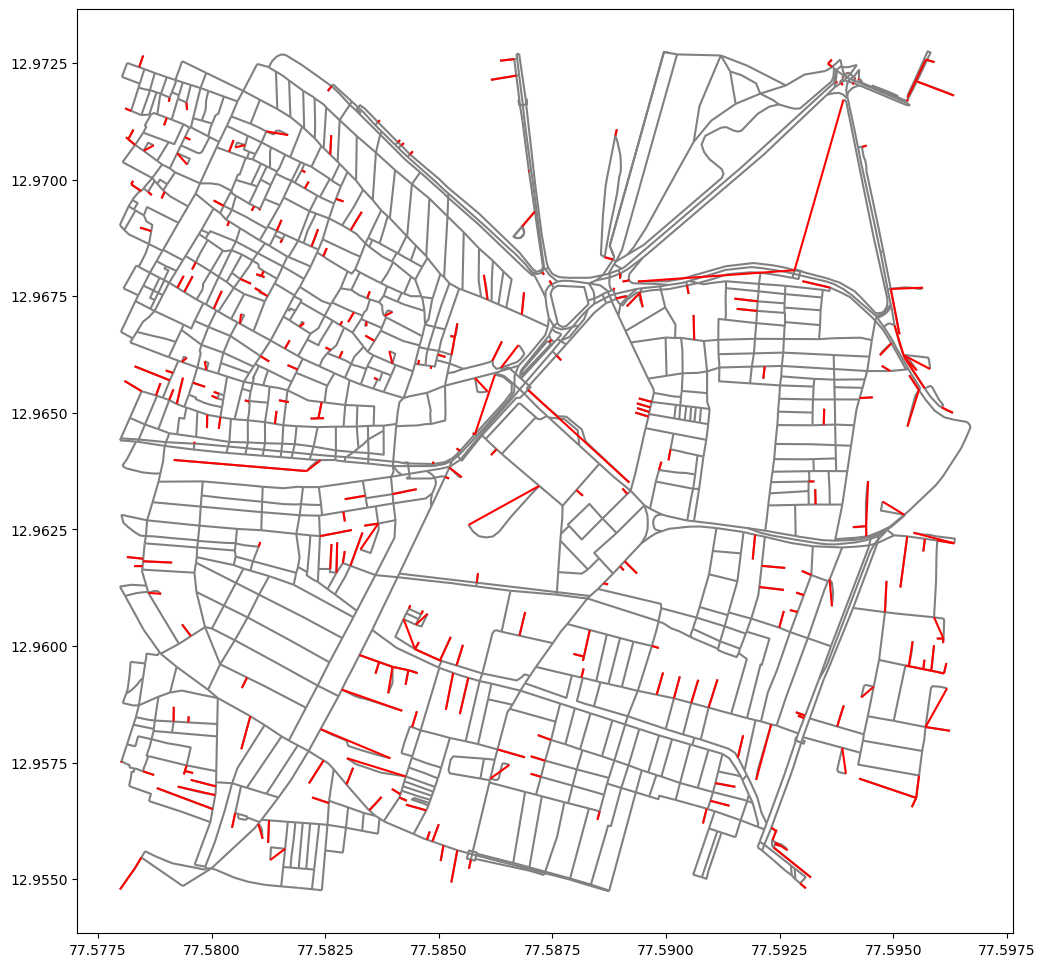
To make visualization and analysis (for my computer) easier, I have taken a part of the network of central Bangalore with Pette area and surrounding. Similar map of ‘residential’ (although most of these roads are commercial) roads and other roads.
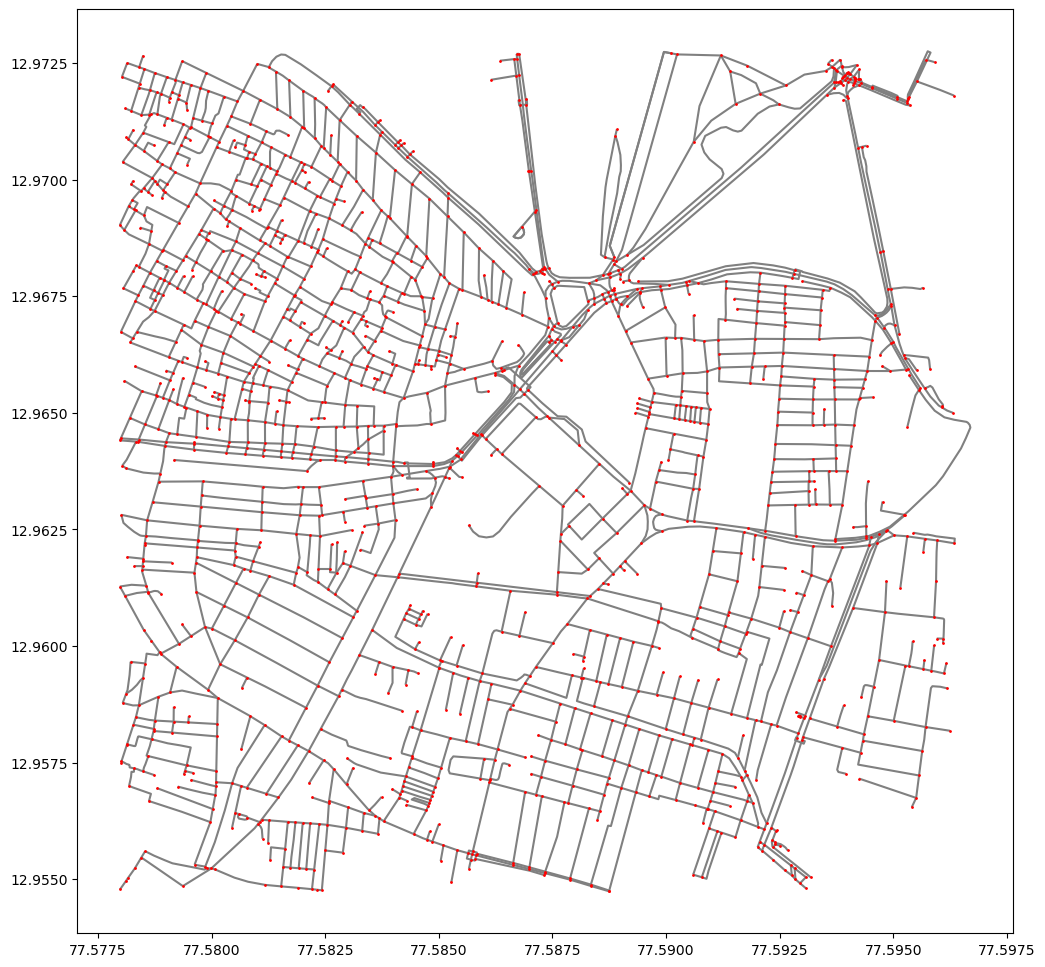
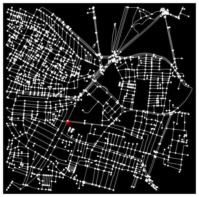
The network given by osmnx and taken as a network graph in networkx is shown below with edges in grey lines and nodes as red dots.
The dead-ends are more clearly visible in the map below. The extended deadlines you see in some cases are the ends of the connectivity from the connected component to the dead-end point - in euclidian distance form. In my Bachelor’s thesis it was found in interviews that these dead-ends were considered safer (long back) as there were less escape routes in case of robbery, theft, etc.
The point with the highest betweenness centrality is given as the red dot in the map below. It is to be noted that this point is only in relation to the map shown and not the whole city. That analysis is computationally taxing.
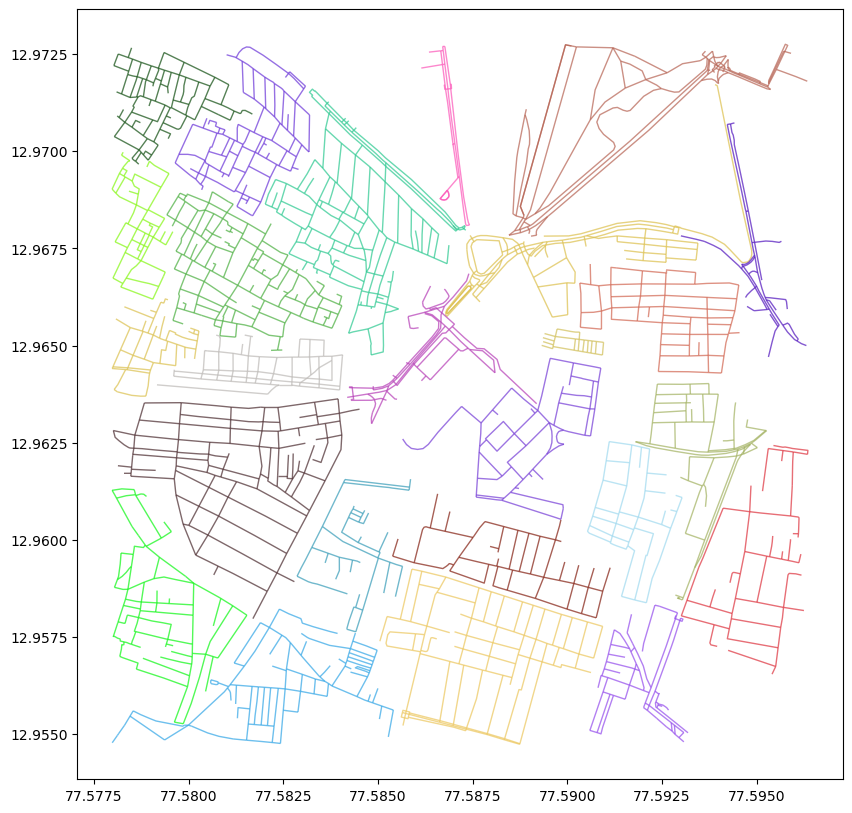
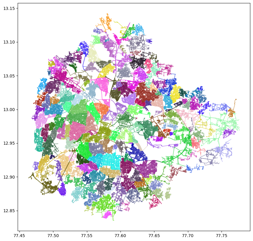
I also wanted to look at the connected components subgraphs using cliques or communities. While cliques and some community detection tools only work for the normal graphs, I found that using greedy modularity community tool of complex network analysis gives us the result below. It would be amazing to see this for the whole city to see if we could deliniate the neighbourhoods this way - if it is not already. For the part of network graph considered here, the algorithm gives the following road network communities:
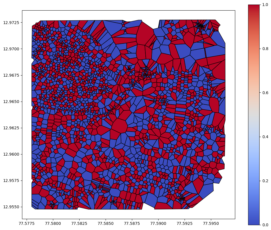
To know how much of an area one road serves its surroundings and subsequently know how it divides the space up, I took the centroid of each line and did a vornoi space analysis from those points for Pette area. Take this with a grain of salt as its not done on clean road network (there are more than one line representing the major roads). This is how it is:
I got the communities/neighbourhood map for Bangalore too:
I will update this page as I get to more analysis on the road network. I have a few other analysis worked out such as connected components, the nearest road to dead-ends – so it can be found out which ones can be connected and got alternative routes for etc. Some of it needs to be scaled up from my test area to the whole city and some need cleaner data. Stay tuned and come back for more updates later!