A curiosity-driven self-driven serendipitous journey
Correlation is not causation. The professor in the Coursera course I audited (I only audit courses because I take information from various courses and textbooks, blogs, videos, swirl courses and papers). says: ‘There is no causation without manipulation’. But you can apply causal inference not just from the treatment and control groups by performing randomized controlled trials but also from the treatment and control groups from observed data. To learn, in addition to all the theories and concepts, I wanted to test the causal inference to a well-known (to me) dataset of migration flows and a fairly known phenomenon to see what the causal inference methods say. This is faster and a lot of things get clearer with real-world data. Although there are many methods, I started focusing on Instrumental Variables and Difference-in-differences and learnt about confounders, control and treatment and so on! For IV I needed to know more about confounders, blocking, unaccounted confounders etc. and for DiD, I needed to know more about control and treatment groups in observational data and for causal inference in general, I needed to know about Directed Acyclic Graph (DAG). I have worked with time-series analysis, I love statistics and there is causal inference in time series as well - grager causality. Causal inference as is every other awesome topic is an ocean in itself. I am at the shore but: Onwards and upwards!
Data
The migration data is the one I used earlier in a publication. It uses 2001 and 2011 data from the Census of India, cleaned and filtered, where I have only considered inter-state migration. This is then converted into a weighted bipartite network using networkx (python) with spatial data, which shows flows from states (state centroids) to districts (district centroids).
I first got the idea for doing the bipartite network analysis while learning about network analysis where the csv data was mentioned. It is from this article where it mentions the data is up to 2014 which helps my case because I have migration data from 2001 and 2011 only (although 2011 was released in 2019).
While I wanted to do a multi-layered bipartite network analysis where I wanted to see how the rail is related to the migration network, I ended up exploring the different methods and using causal analysis for bipartite networks.
The cleaning took a long time - where I ran into tiny (read tiny to identify and find solutions but took long to clean) issues such as matching and equalizing different network types and making a bipartite set of the rail network to make analysis possible, bringing my migration data into network form, converting rail station data into district and state target and source dataset, keeping the nodes same for all three networks: 2001 mig, 2011 mig and 2014 rail, and I ended up cutting off rail networks which connect outside of the country and I have also kept the largest connected component as the rest of the data is not relevant to my question of if the two are related. Stand-alone migration flows and rail routes are of no consequence in a causal analysis (is my interpretation).
So I cleaned the data into three very beautiful weighted bipartite networks with the same nodes - node set a (states) and node-set b (districts). The weights for G1 and G11 are the number of people migrating and Gr is the number of trains connecting the pair of nodes (stations, which were then converted into state to district network). I performed a lot of network analysis and statistical analysis to get to know the data - some of which make great sense to show here for a better understanding of the method and data: causal inference of the network datasets.
We will call the rail network Gr and migration network G1 (2001) and G11 (2011), where G stands for graph (common variable name used in networkx, even though it is B for bipartite, but as it is still a graph..).
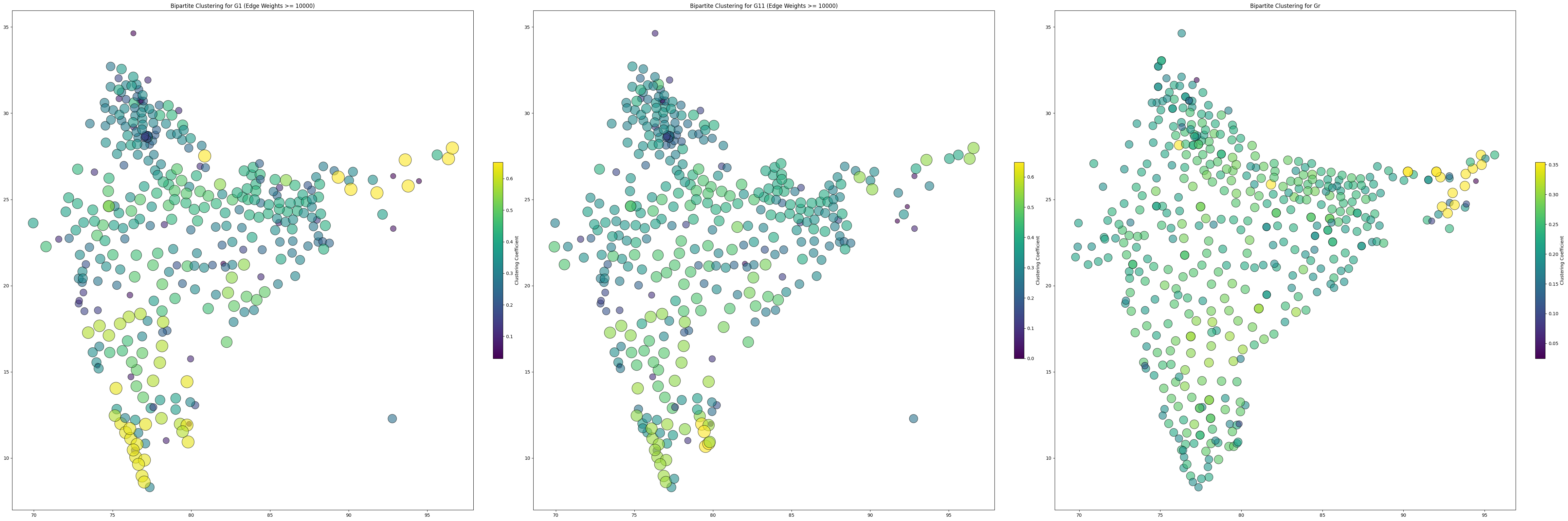
Analysing the three graphs individually, in the above plot, we can see nodes with yellow colours indicate higher clustering, meaning they have more similar connections to their neighbouring nodes (state and district pairs) and are likely connected to similar destinations or origins. Nodes with bluer colours exhibit lower clustering, suggesting more dissimilar patterns in their connections compared to their neighbours, possibly indicating unique or isolated migration patterns or connections.
The weighted bipartite networks themselves look like this:
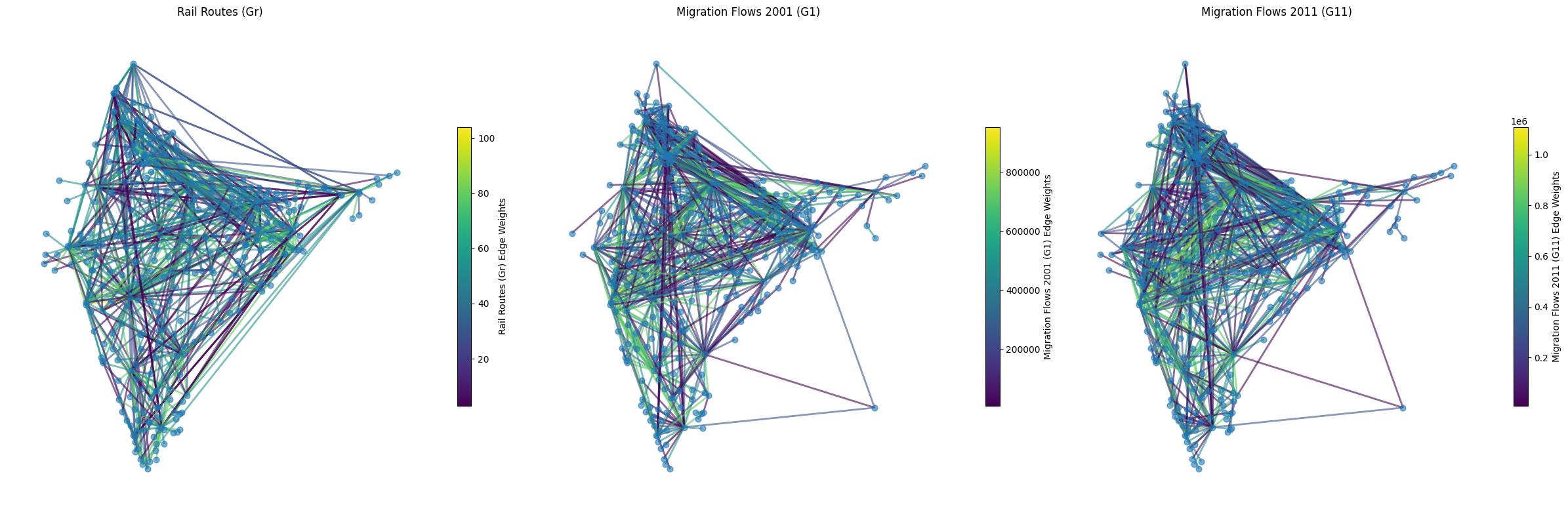 where the weights are given by edge color and nodes are all the same blue.
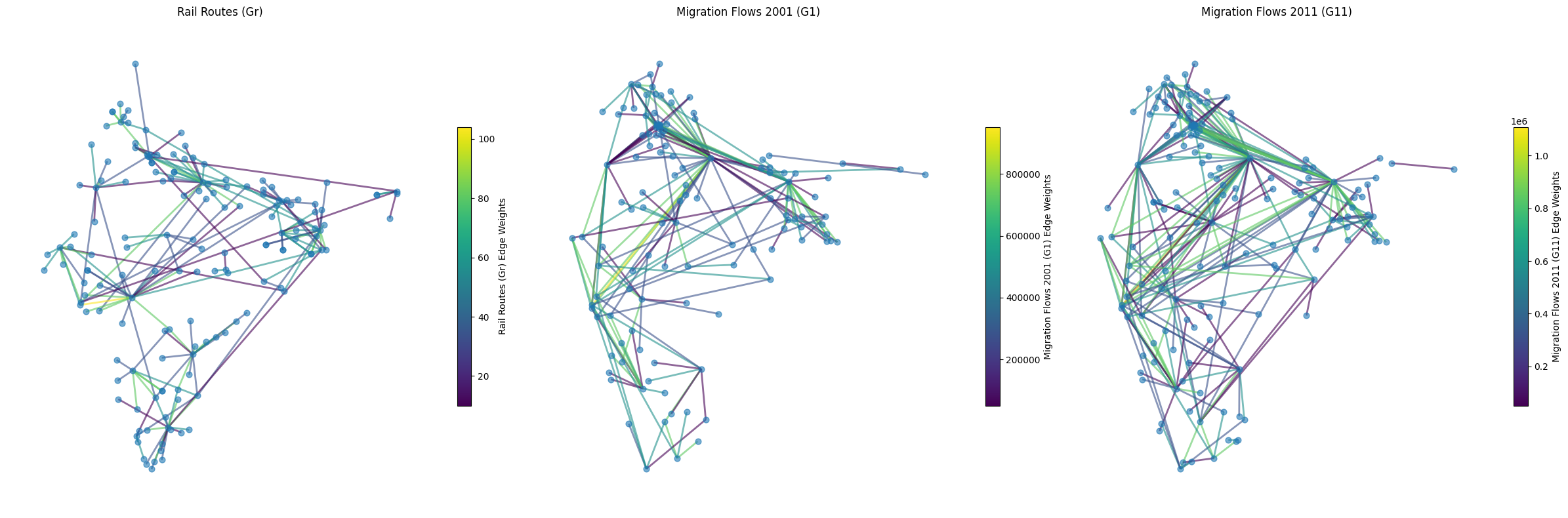
Even though the thresholds in the above are weights shown above 10k migrants and >3 rail routes, the graphs may not be easy for visualization, so dialing up the threshold to 50k migrants and a min of 10 rail routes, we get the (easier) visualization:
Rail network is a key driver of interstate migration in India
For the rail routes to be related to migration flows, the data need not be correlated. I got a weak positive correlation coefficient of ~ 0.37 for both Gr with G1 and Gr with G11, while G1 and G11 are similar but G11 is of far greater magnitude; an r squared value (coefficient of determination) of ~ 0.14.
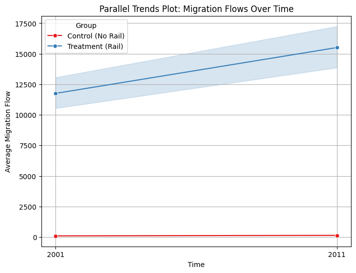
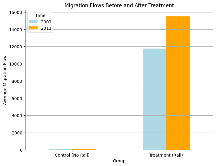
Control and treatment in observed data are visualized below:
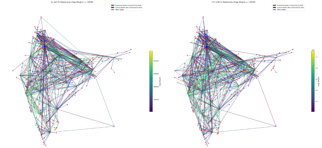
Here while the edge weights show the weights (flow of people or number of trains connecting the two node pairs), the red shows the node has rail connectivity and blue nodes do not have rail connectivity. Here it is assumed that this is the case even before 2001. The 2014 rail data is also assumed to be present before 2011 - as in that there is not much change between 2011 and 2014 - this is a very important assumption as the whole causal interpretation falls to ruin if we consider the rail routes were different before 2014. Here control are the nodes which are not connected by rail - between the years 2001 and 2011. And treatment are the ones that are. We are assuming that the rail data is also the same as 2014 between the years 2001 and 2011. As rail routes do not change drastically (given terrain and other physical features), this assumption most probably holds true.
Results
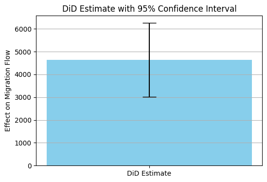
I got a Difference in Differences result of 225.36 with a regression analysis with interaction terms result of following values where regression was controlled for treatment and control (binary 1 and 0), for year/time 2011 and 2001 (binary 1 and 0) and the interaction term (treatment x time) which gives the DiD effect.
DiD Estimate: 4643.392623492884
Standard Error: 825.3869288494859
95% Confidence Interval: (3025.634242947892, 6261.151004037876)
The DiD estimate is statistically significant.
I then looked at controlling for population as a confounding variable which affects both migration flows as well as rail connectivity but got amazing results again:
-
Treatment Coefficient: 8453.11 (statistically significant (p < 0.001)) Shows This shows that the rail is a key driver of migration flows
- DiD Estimate (Treatment x Time Interaction): 3379.06
- The 95% confidence interval is (3116.58, 3641.54) These show that there is a very significant effect of the presence of rail networks (treatment) on migration flow between the two decades of 2001 and 2011
-
Population Coefficient: 5.248e-05 (statistically significant (p < 0.001)) Controlling for the population variable also shows that even the population has a significant positive effect on migration (as expected) but compared to the rail network, the magnitude of influence is negligible.
- Time Coefficient: 11.12 for the control group - not significant ((p = 0.361) The control group here is nodes without a rail connection, which is not significant. In other words, for nodes without rail network, migration flow has not changed much over the two decades.
In addition to the bipartite network (node-sets a and b) analysis I also did a one-mode projection of all bipartite graphs onto their respective destination districts and got the following values among others, which are needed for a better understanding of the individual networks themselves:
One mode projection - network analysis of district node sets:
Degree Assortativity Analysis
Degree Assortativity for dis1: -0.9367
Degree Assortativity for dis11: -0.9367
Degree Assortativity for disr: -0.7219
Negative values of degree assortivity indicate that high-degree nodes tend to connect to low-degree nodes. Hub and spoke structures follow this pattern where highly connected districts are connected to low-degree districts or peripheral nodes. Here while migration networks (dis1 and dis11) show this pattern, rail networks (disr) have lower negative assortivity.
Correlation (dis1 vs dis11): Pearson R Result (statistic=0.9999999999999998, pvalue=0.0)
Correlation (disr vs dis11) and (disr vs dis1): Pearson R Result(statistic=0.44427242911282966, pvalue=1.2368357007826973e-20)
The earlier mentioned similarity between the G1 and G11 graphs is shown above by the correlation coefficients and we can notice that one-mode district node projection has a slightly higher correlation coefficient than that for bipartite graph (with both node sets).
There is also sensitivity analysis (E-value), bootstrapping to see how ‘robust’ the results are, etc. But I am yet to get to that part. So for now, I have posted the results so far and their interpretations.